
Business analytics tools such as dashboards in Excel lead to strategic thinking and smarter business. Sounds good, I’ll take some of that. But what exactly are we talking about? And can I really use my data like that?
If the growth of your business is important to you, one of the most important things you can do is to unleash the power of your data to show you what is happening, what is changing for better and worse, and what you can do about it. Businesses of every size use custom dashboards to provide graphical insights by organizing the data in ledgers, spreadsheets, databases, and more. Although dashboards can look visually sophisticated when finished, they can be implemented by any business, in the office software you are already using. Here we will take a look at a dashboard and how it helps a company identify an improvement it can make right away. Then I will offer some tips and advice about how you can think about the visualizations that are right for your business, and how you can get started on your own.
What is a dashboard?
By “dashboard” we simply mean a presentation of your business data in a way that is:
Current, and Meaningful to your success,
Current: A Charts and tables are a powerful way to engage with your data, but a static result is of little lasting value. Charts in a dashboard are linked to your data, so that as your data changes, these snapshots adjust to show you the most up-to-date status. With the right features, these dashboards allow you to filter, slice, or even play back your data to see it from different perspectives change over time.
Meaningful: The other crucial distinction for a good dashboard is that the chosen visualizations need to be the right ones. Just because you can make a pie chart of all of the products in your inventory doesn’t mean you should. A good dashboard avoids unnecessary chart junk, and contains only those that measure something important to your business’ success. And typically, these charts will be selected and arranged together so that they present a bigger-picture of what you are trying to measure.
Why do you need one?
A typical business is focused on the day-to-day flow of visits, sales, projects, products, and other transactions that are the lifeblood of the business. The expression, “Can’t see the forest for the trees,” might apply to you if you have no way to step back and look at those transactions, records, or what have you, to see if you are still headed in the right direction. Are sales, profits where they need to be? Are they slipping? If so, why? Is productivity going up as you acquired new equipment of staff? If so, where do you have capacity to take more business? Where will it be most profitable? Sometimes our instincts don’t match the data. Other times, our instincts are inspired by data visualization. A picture is worth a thousand words.
Example — a growing business
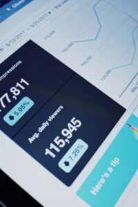
This illustration of a dashboard depicts a landscaping company’s client servicing history. A key performance indicator (KPI) for this small company is timeliness, because they know that customers will change their weekly lawn service to a larger provider for reliability. Specifically, clients specify their most preferred days for lawn service, and Notional Landscaping’s goal is to meet this need for all clients. This dashboard plots data from the first four years in business to the present day. The KPI of interest is charted in the “Quality Service” trend chart, and the line shows how closely the company has adhered to the goal of servicing on days designated priority 1–that is, “on time”. To the right, the same data is depicted as the on-time performance of the crews and the crew leaders assigned to them. The buttons next to the charts, or “slicers”, allow the user to filter the dashboard’s data.
As seen in the demo, interacting with the dashboard reveals some important insights about the company’s performance and pace of operations. For the first two years, as a small business of one to two crews working less than full time, they did extremely well. The quality service trend shows, unsurprisingly, that with only a limited client base it was not hard to please almost each one. In 2014-15, the client base grew and the company added crews, the company struggled to maintain that high level of honoring client priorities. Crews struggled to keep up with the increased demand, and clients ditched. It is also apparent that while on-time performance generally does not vary much by territory or even crew there is one crew leader who is clearly excelling at meeting client requests. It might be wise to get her help in fixing this across the board. And a company-wide conclusion is that while on paper they have the capacity to service these customers, the scheduling has become too complex to do efficiently every week.
Tips on implementing your own data visualization
If you are considering how you can use dashboards in your own business to track and improve your performance, here are some steps and tips for you to get started. Although data visualizations are as unique as your particular business and situation, these principles are common to ALL.
1. Know what matters. Answer this question first. Give some serious thought to what measures of success are most important to your business. The ones that really matter will be a short list. For Notional Landscaping, timeliness in meeting customer requests was most important to keeping them competitive with larger providers. Once you know what those measures are, then you can think about how that information could be ideally presented to you so that you can measure and track it.
2. Know your data… or at least find it. Every business keeps data. Transactions are in your general ledger. Products, services, clients are often additionally kept in spreadsheets or databases. Where do you keep your schedules? Do your bookkeeping? You may even have some industry-specific software for running your business. Every one of these sources will have the data you need to produce your dashboard. There are many ways to collect and connect to this data. Today’s office tools provide some pretty impressive facilities for pulling this together. Excel’s latest Power Pivot data tools are a great example of this. For the adventurous, there are tons of resources on the Web to help you learn and use these. Which brings us to…
3. Learn to use your applications like Excel, Access, Google Sheets, or whatever is your go-to office software. Spreadsheets, as alluded to above, have come an awfully long way. In fact, with the more advanced features in Office 2013 and 2016, the lines between spreadsheet and database are becoming truly blurred, and it is now possible to create relational data and perform big data analysis from Excel. The already-powerful pivot tables and slicers are now stepped up with Power Pivot, custom “Measures” or formulas for re-use in your visualizations, and KPIs. If you are using Excel as a glorified list-keeper, you are missing out on a lot of great features and possibilities!
4. Decide who, what, and how often. That is, who is the audience for the dashboard (perhaps just you, or maybe other business stakeholders). What do they need to see, and in what manner will that be most effective? And finally, how often do you want to update the data or view the dashboard? Some are meant for periodic review (of, say, quarterly performance). Others provide a daily, real-time view of current operations. Knowing what each prospective dashboard is for will help you focus and design the perfect aid.
5. Be open to change. Your focus might change over time, your priorities may evolve. OR you may find that only after engaging with the first version of your dashboard for a while do you really know what you want the next version to be. Just like the business insights that come from these visualizations, this inspiration is born of experience and reflection.
6. Get expert help. Some of the best dashboards result from a user’s initial efforts as a way to jump-start a conversation with an office expert about advanced capabilities. When your DIY efforts have taken you far enough, call on me. I will be glad to review your project and your goals.
Put data visualizations to work for you in your business. Once you know the what and the why, you will grow and succeed in a whole new way.